Flipboard is a social-network aggregation, magazine-format application software for Android and iOS. Flipboard has one of the most elegant layout and browsing experience of any other app I tried, and it is optimized to look at its best on all devices. I had tried many different readers so far, and this is the only one that has sticked with me for the last few years.

Rating: ![]() Price: FREE.
Price: FREE.
The Good:
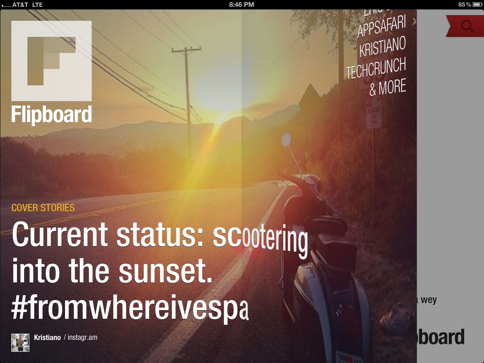
Once you had set up all your feeds, the initial screen of the app will feature in a beautiful full screen the most popular entries.

The transition between pages simulates flipping the pages of a magazine and it is just gorgeous.
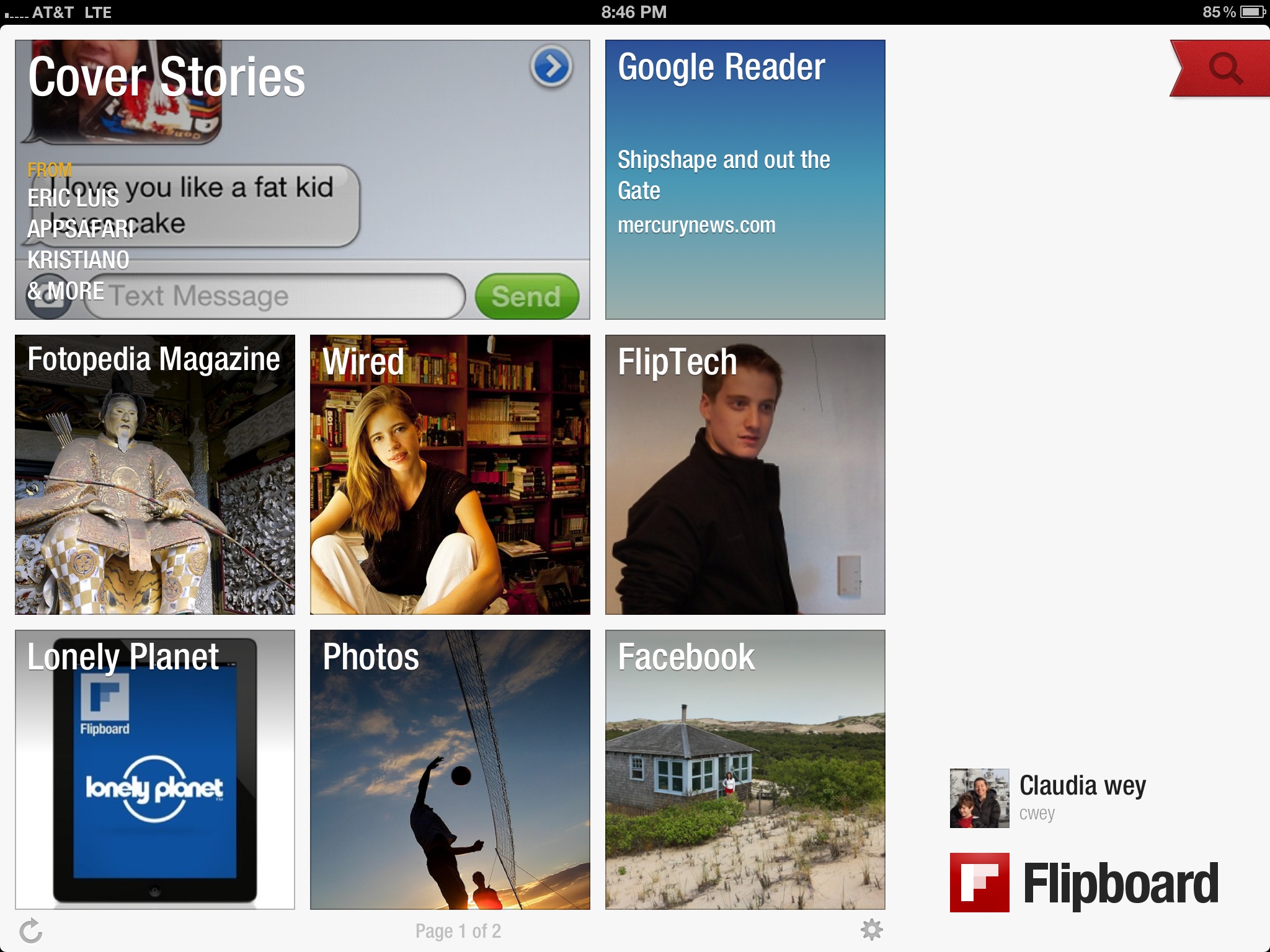
When you get inside you will be able to get to all your feeds. The most popular entry for each feed is featured in this page.
Tapping on the magnify glass will open a panel, to browse for additional feeds you want to add. All available feeds are organized by categories, which helped me discover some very interesting content.

Feed entries are displayed in a tabloid format. I was amazed how information looks more interesting when displayed in this format rather that in a list. The tiles are sized according to the relevance, and their feature both text and images from every entry in a very attractive format.
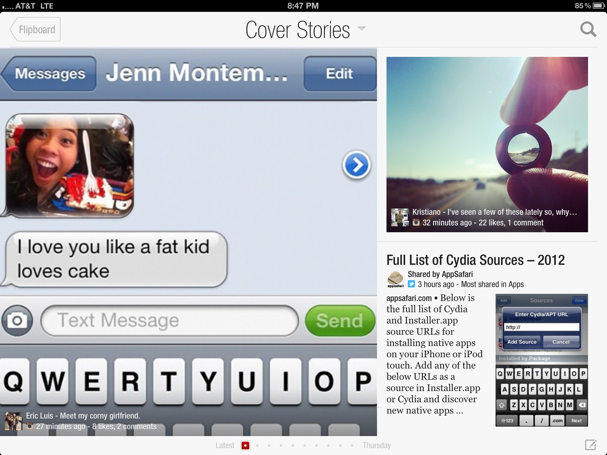
Some of the articles are displayed in a very clean are readable format which is stripped down from all unnecessary information you may have to view in the original web site.
When an article spans multiple pages you can flip the content as you would do in an actual magazine.
For some reason I find this as a very satisfiable experience.
Articles which are mostly pictures based are displayed in a gorgeos format that gives really enphasys to the images. Below an example of an article on Compemporary Homes in Brazil.

This is how the same article looks like on the source site.

The Bad:
Flipboard used to display all articles in a clean reader format, which stripped out of all unnecessary elements that were part of the original page.
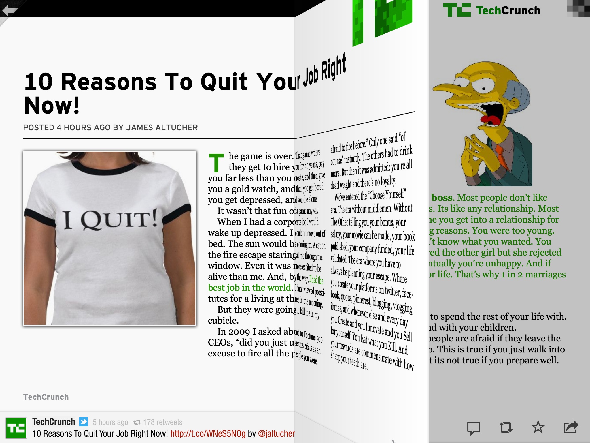
In a recent update most of the articles are now display with a split view. The top area display an image and a portion of the text, while the bottom area allows to the get to the full article from the original web source.
This unfortunately exposes the user to all the clutter of the original web site, including obviously to all the promotional information. I understand that Flipboard may have had business reason to do that, but it is too bad for the user.
The image below displays an example of the article in its original format.
I definitely miss the reader view, which I was a much cleaner and elegant solution.
My second small complain is that articles are marked as read only when expanded in full display.
Both these and the reader view are the two features I miss from Feeddler RRS Reader Pro, which had an option for marking articles as read from their list view. Reading the summary in many cases is enough for me to consider the article as read.
Rating Breakdown:
![]() design
design
![]() features
features
![]() reliability
reliability
Resources:
Most of the magic of Flipboard comes from the interaction. The transition between pages simulates flipping the pages of a book. Watching this video to get a better sense of how this feel.
 Posted in: rss feed


0 comments:
Post a Comment